Redesigning the perks platform used by 70% of the Fortune 1000
Perks at Work reaches more than 30 million employees across more than 50 countries. As co-Executive Creative Director at Dreamspace, I led the UX and UI design of the whole platform, thousands of pages, while it kept selling.
- Role
- Co-Executive Creative Director, UX and UI design
- Partner
- Timothy Ambler, Co-Executive Creative Director, brand and rebrand
- Began
- August 2015, inside Next Jump’s New York office
- Used by
- 70% of the Fortune 1000 and 90,000+ companies
- Scale today
- 30M+ employees in 50+ countries
A store that sits inside the employer.
Perks at Work is a members-only shopping platform that employers give to their people. An employee signs in through their company and finds discounts and offers from retailers and brands. For the employer it is a benefit. For the retailer it is a channel into a workforce. For Next Jump, the company behind it, it is the business.
It operates at a scale few shopping platforms reach. Next Jump reported more than $2 billion in annual sales in 2016. Today the platform reaches more than 30 million employees across more than 50 countries, and it is used by small businesses and by 70% of the Fortune 1000.
A platform at that scale is not redesigned the way a website is redesigned.
We started by moving into the building.
In August 2015, Dreamspace built an in-house team for the project and moved it into Next Jump’s New York office. We worked from there, embedded in their daily routine, next to the people who ran the platform every day.
Understanding the company from the inside came first. The brand, the platform and the rollout plan all followed from how Next Jump actually worked, not from how a brief described it. Over time the engagement grew from branding into a full overhaul of the brand and the Corporate Perks platform.
It could not stop selling.
The platform was taking orders every day, and the company’s 700 employees around the world were working against it. There was no pause button, and no version of this project that began with one.
The redesign had to happen in the open, one release at a time, on a platform customers were using that minute.
Forty feet of sitemap.
Before any page changed, the whole system went on a wall. The sitemap ran forty feet and held thousands of pages, each one to be redesigned in a short time and released in phases.
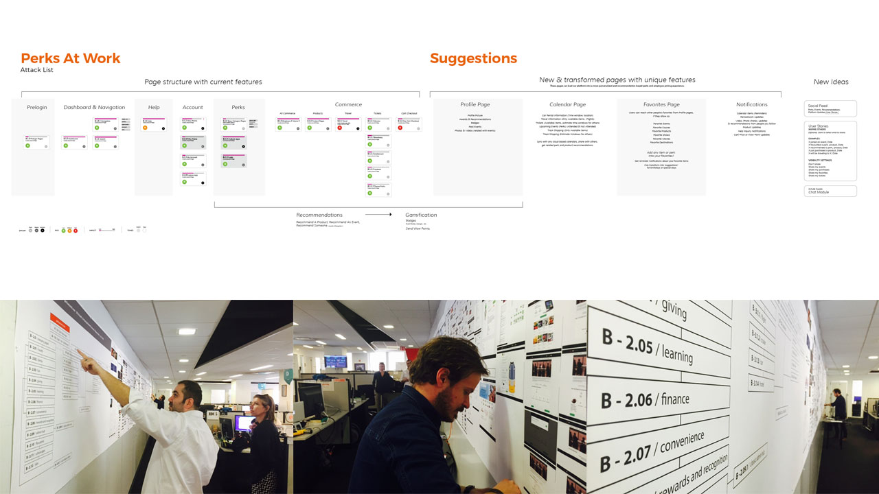
A wall that size shows what a screen hides: how many pages there are, how they connect, and how much has to move together.
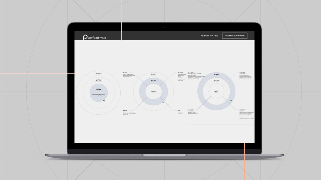
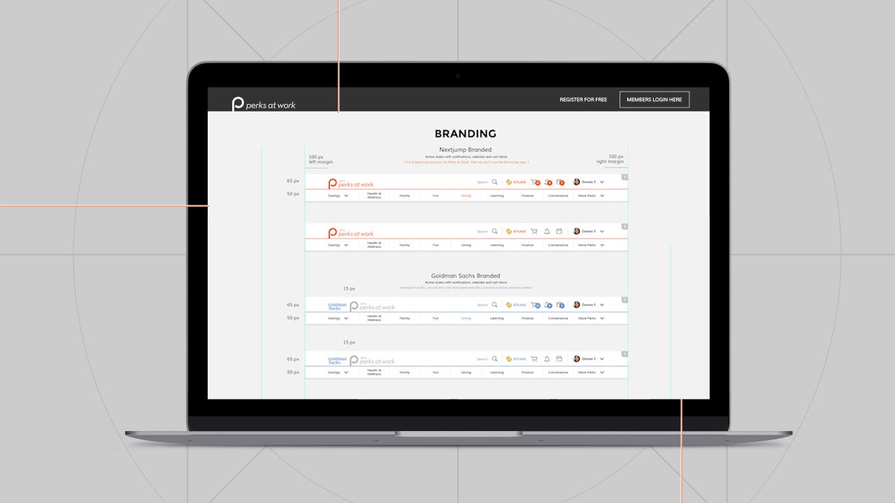
One brand, written down so thousands of pages could follow it.
A redesign this size only holds together if the rules are written down. We wrote the Perks at Work brand usage guidelines: the mark, the color palette, the treatment of full-screen title cards, and the way the brand steps back when a partner’s brand leads.
Timothy Ambler and I were co-Executive Creative Directors. Timothy led the brand and the rebrand of Next Jump’s identity. I led the UX and UI design of the entire e-commerce platform. My team at Dreamspace executed the rebranding collateral and distributed the materials across multiple mediums, across the whole brand ecosystem.
Orange is the primary color, with a set of neutrals and accents for everything else. When a partner’s color leads, the Perks at Work wordmark goes neutral gray, so the two never compete.
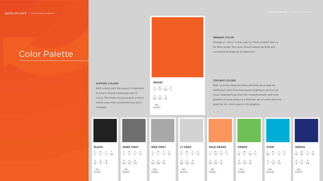
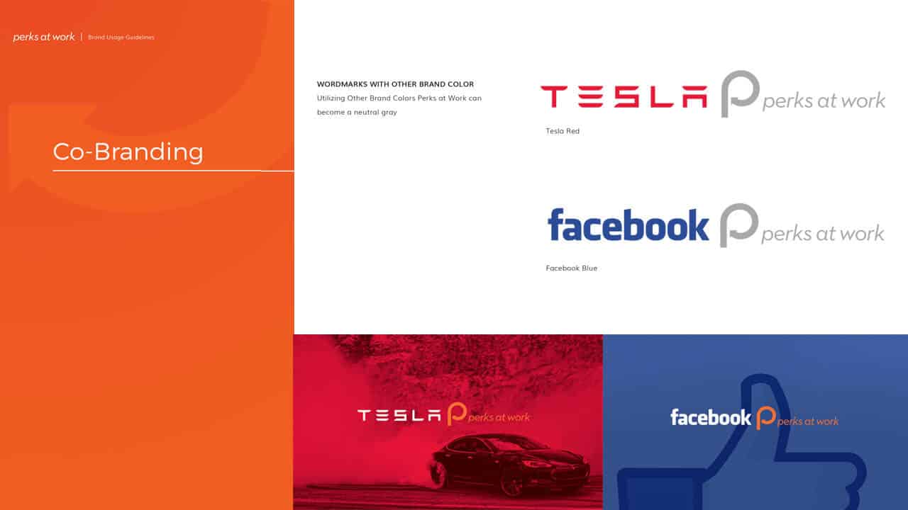
A platform designed as a set of rules, not a set of pages.
Thousands of pages cannot be designed one at a time. We defined rules for how headlines, single items and categories behave, then applied them across every kind of page.
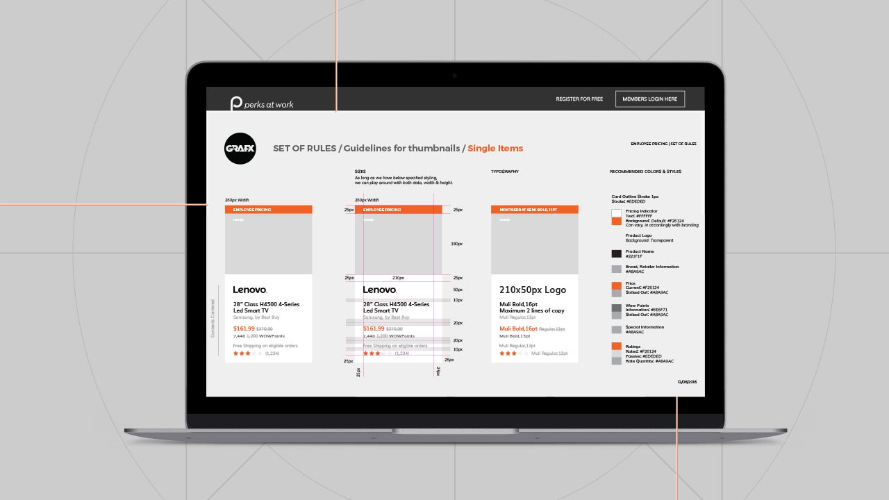
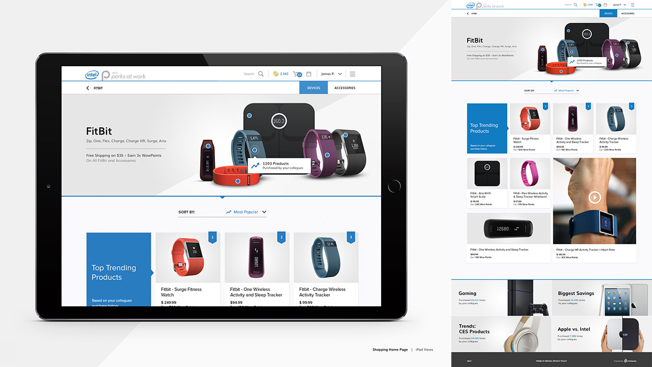
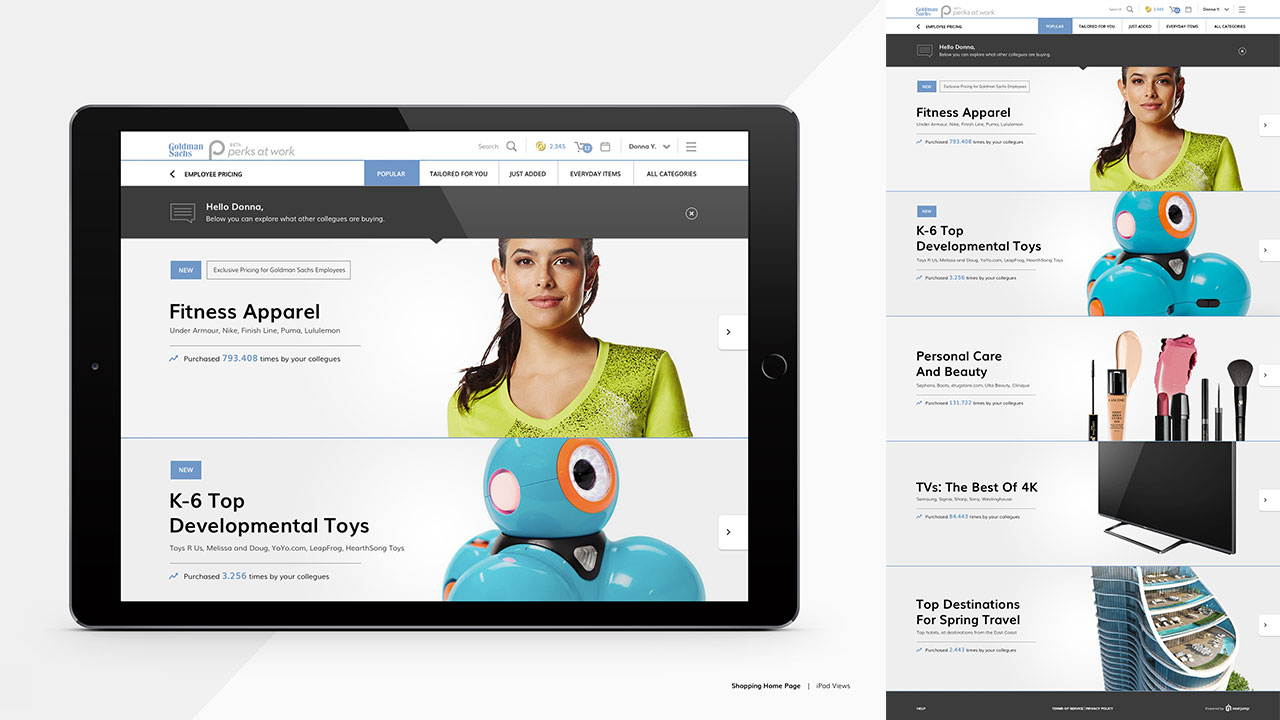
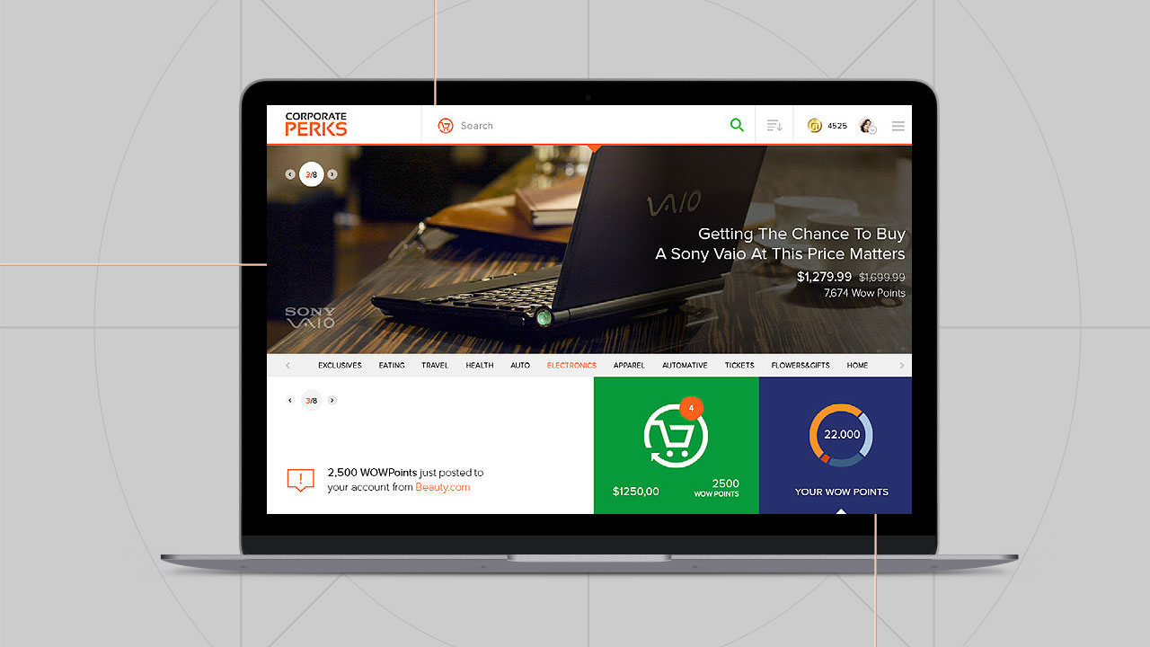
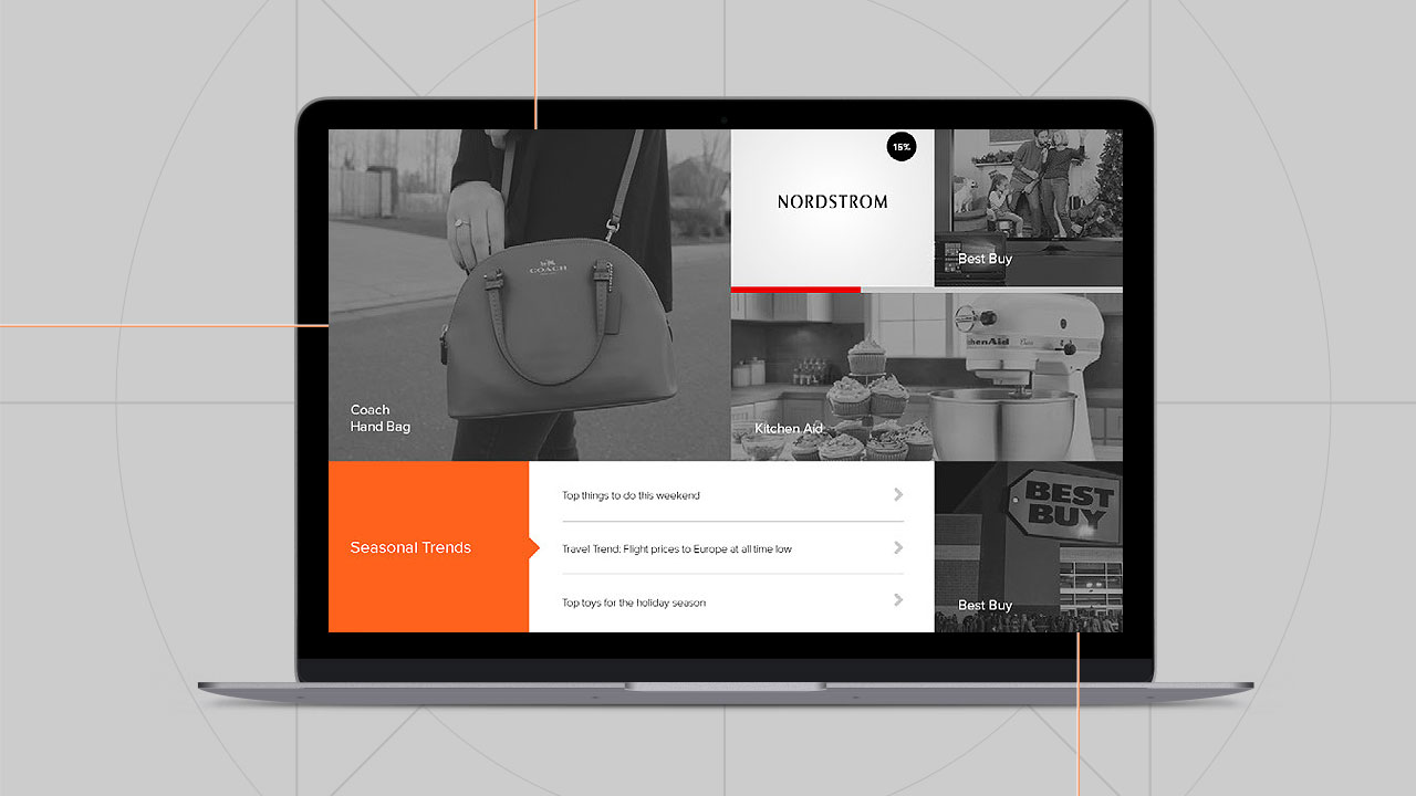
The goal was a shopping experience that reads the same whether an employee lands on the home page, a category or a single retailer.
Brand first. Then the platform. Then the next business.
Every phase went live on a platform that was already selling. That changed how the work had to be designed. A page could not depend on a later page being finished.
The brand shipped first.
The new brand identity and guidelines went out ahead of everything else, so each later screen inherited the same colors, type and partner rules.
The e-commerce platform came second.
The full redesign followed: the thousands of pages on the wall, released phase by phase while the store kept taking orders.
The Academy was planted inside it.
With the brand and the platform in place, we put the base of a second business into Perks at Work, the Leadership Academy. We planted it and left it there.
A new screen had to sit next to an old one without the customer feeling the seam.
To make thousands of pages feel like one product, every page drew from a single visual system, built for the platform and applied across the whole ecosystem.
A perk is not only a discount.
Perks at Work is not only a place to buy things for less. Becoming a leader at your company and working out your future there is a perk too.
Learning to lead belongs next to the deals.
At the time, Next Jump’s Leadership Academy was free. We built the idea of the Academy into the Perks at Work platform, so that growth sat inside the same place employees already went for savings and rewards.
That was the base of a second business for Next Jump, planted in the platform and left there. What Next Jump built on it afterward is theirs to tell.
The brand left the screen.
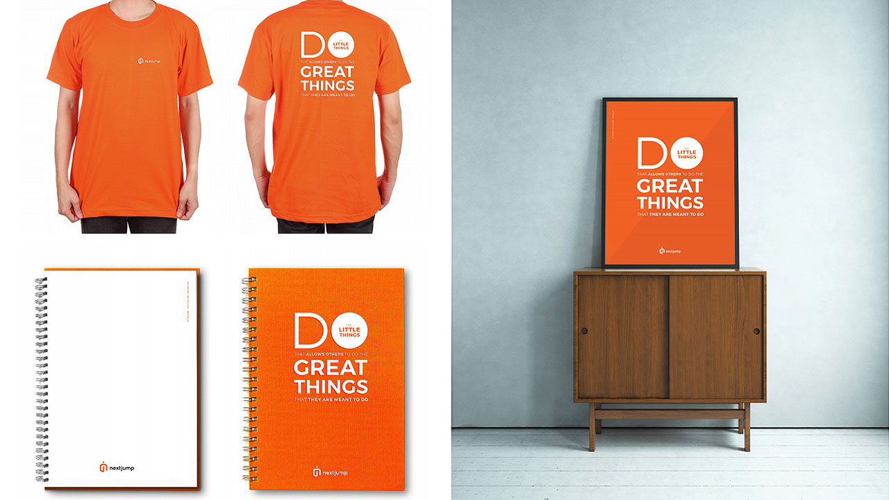
The identity extended into a Health + Wellness sub-brand and the merchandise around it, and into notebooks, shirts and posters carrying Next Jump’s “Do Great Things” line. We also produced the brand films that told the story.
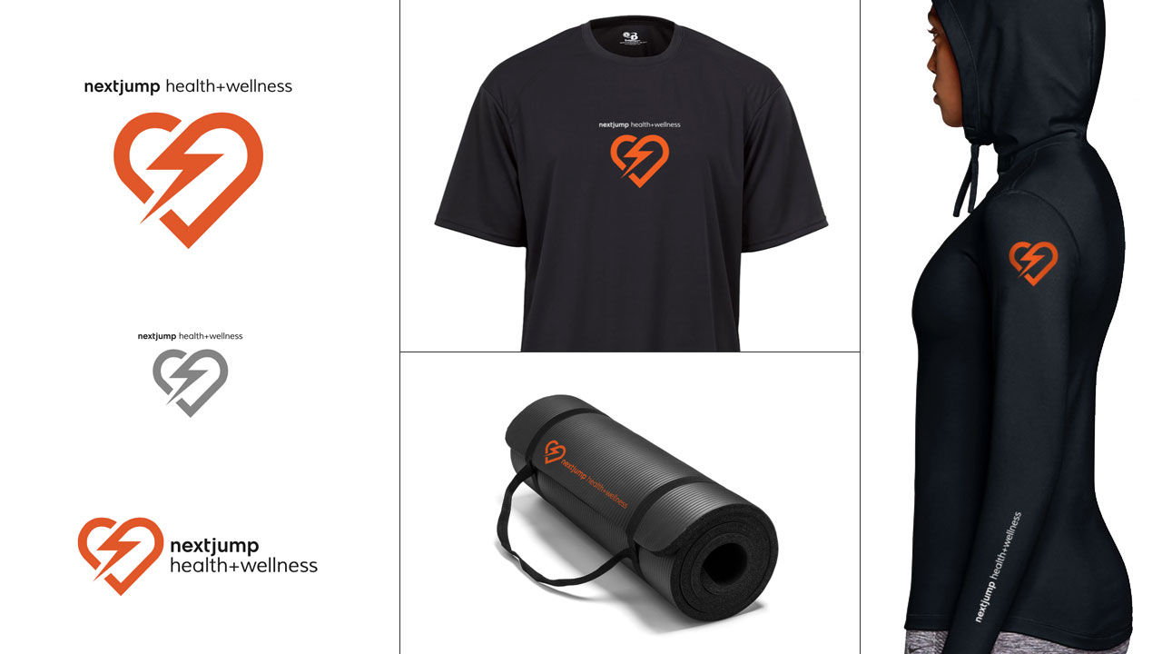
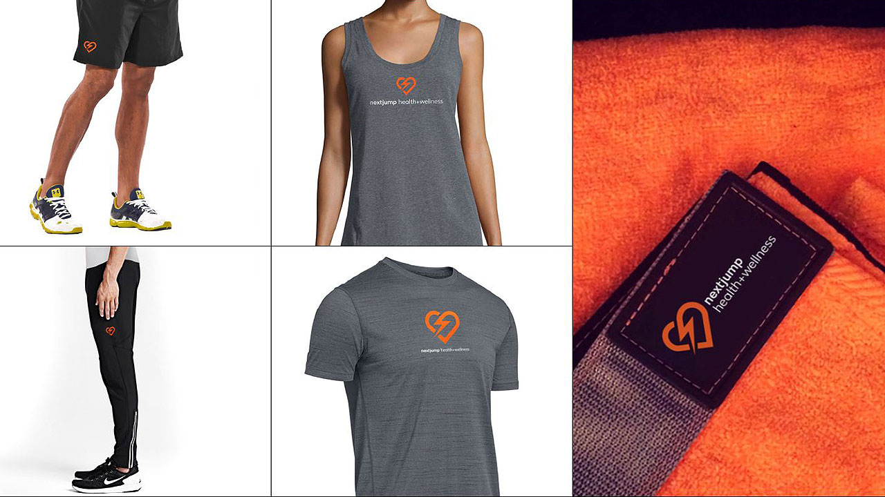
What carries to any company at scale.
Start inside the building.
Work next to the people who run the thing. The plan gets better and the rollout gets safer.
Map the whole system first.
Put every page, flow and dependency in one place before changing any of it. The size of the job decides the order of the work.
Write the rules down.
Thousands of pages feel like one product only when they draw from the same rules.
Release in phases that can stand alone.
Each phase should be safe to run next to the old version, so no single release can stop the business.
Perks are more than price.
A platform people use for deals can also carry learning and a path to lead.
Next Jump is a privately held company based in New York. Dreamspace designed and executed the platform redesign and the brand ecosystem, beginning in August 2015. Timothy Ambler and I were co-Executive Creative Directors. Timothy led the brand and the rebrand. I led the UX and UI design of the whole e-commerce platform. My team executed the rebranding collateral and its distribution across multiple mediums. Images and films are from the project’s 2017 case study.
Platform figures (30 million employees, more than 50 countries, 70% of the Fortune 1000, 90,000+ companies) are as published by Next Jump and its listed vendor profile, and they describe the platform today. Next Jump’s own sites cite slightly different country counts, so this page says more than 50. Reach means access through employers, not individual shoppers. The $2 billion annual sales figure is Next Jump’s own 2016 report.
Sources: Perks at Work product listing, Next Jump Partners, Next Jump, TipRanks, 2023 and Next Jump timeline. Project page: Dreamspace.
I redesign platforms that cannot go offline.
Creative direction, UX and platform design for businesses that are already running at scale. I lead the design and engineering team, from the map on the wall to the last release.
Start a conversation