From R&D to the logo and game UI: designing Marvel World of Heroes for Niantic
Niantic, the studio behind Pokémon GO, was building Marvel World of Heroes with Marvel. As Executive Creative Director and partner at Dreamspace, I led the research and development that explored more than 15 visual styles, then the logo, the brand and the game UI that followed.
- Role
- Executive Creative Director and partner, Dreamspace
- Client
- Niantic, with Marvel
- Scope
- R&D, brand and game UI
- Came from
- Our work on NBA All-World
- Scale
- 15+ visual styles
A superhero game played in the real world.
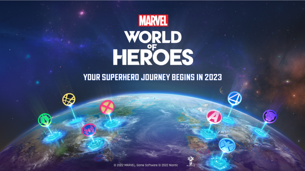
Marvel World of Heroes was an augmented reality mobile game from Niantic, the studio behind Pokémon GO, made with Marvel Entertainment. Players would become their own super hero, customize their look and team up with Marvel characters in the real world. Niantic announced it on September 9, 2022, at Disney’s D23 Expo, with a global launch planned for 2023.
Niantic builds its games around four ideas: draw people outdoors, inspire exploration, encourage exercise and create connection. Dreamspace worked on how the game would look, how it would be branded and how its interface would work.
Two visual styles asked for. More than 15 delivered.
Niantic came to us after we built a working relationship on NBA All-World. The game was still a work in progress, and they wanted research and development that would end with two potential visual styles.
The brief inspired the team so much that we delivered more than 15.
Going past the brief changed the job. Niantic asked us to redesign the entire game UI and to handle key branding work.
More than 15 ways the game could look.
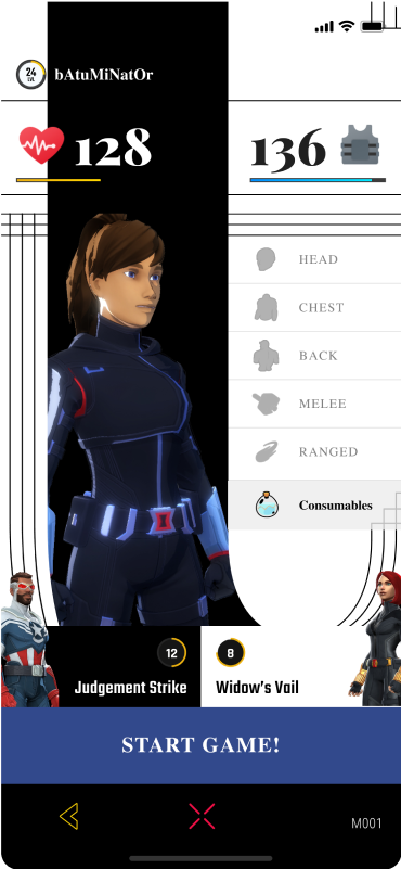
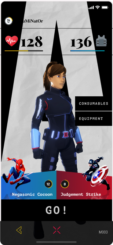
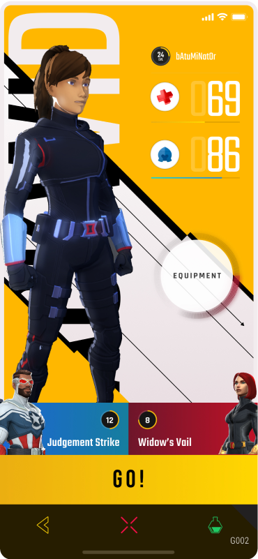
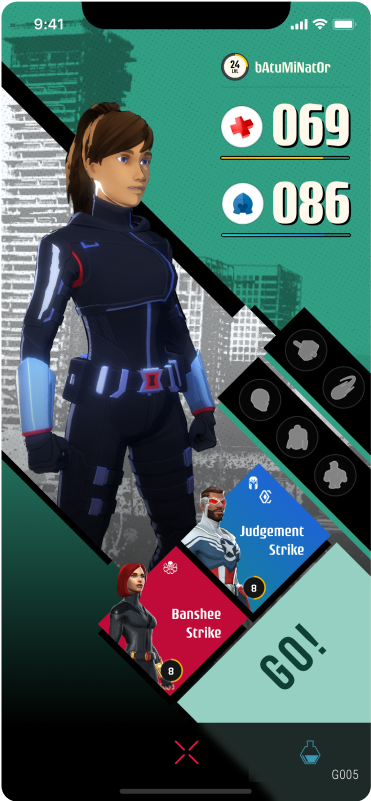
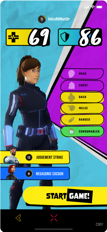
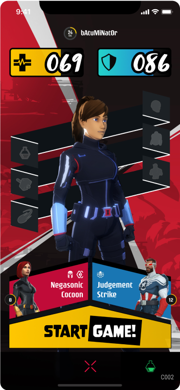
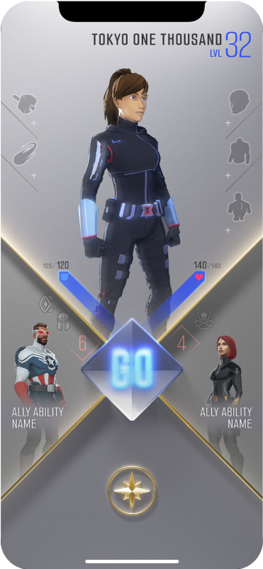
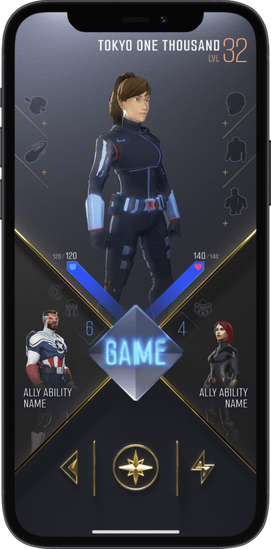
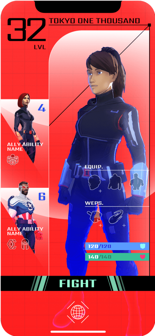
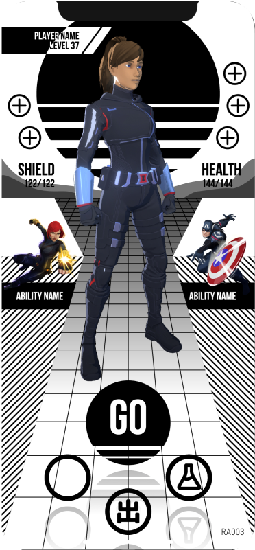
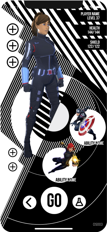
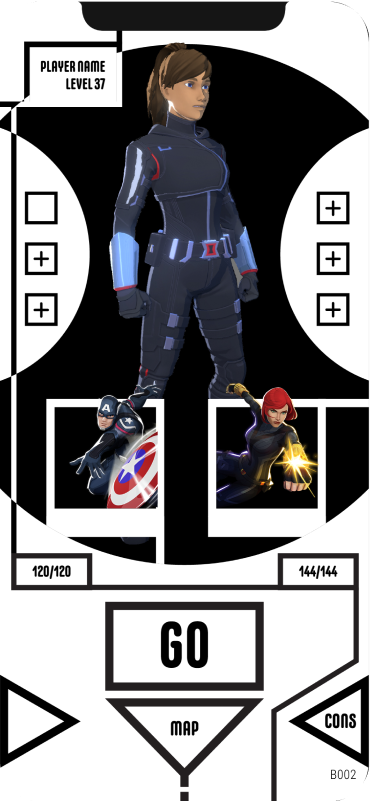
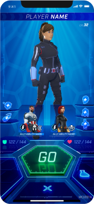
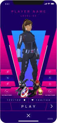
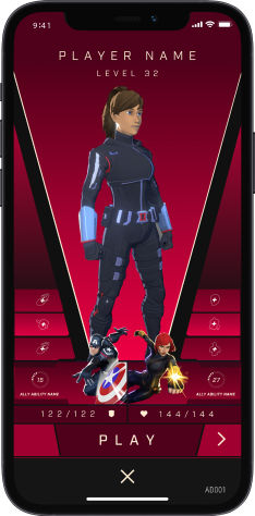
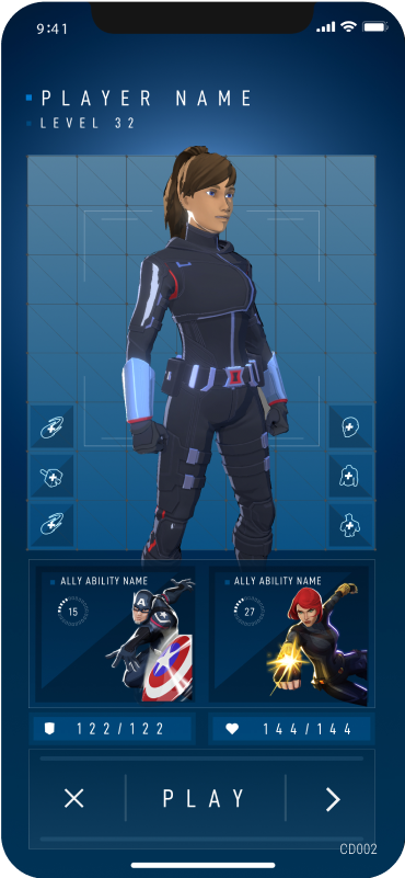
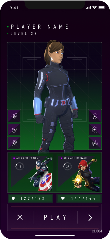
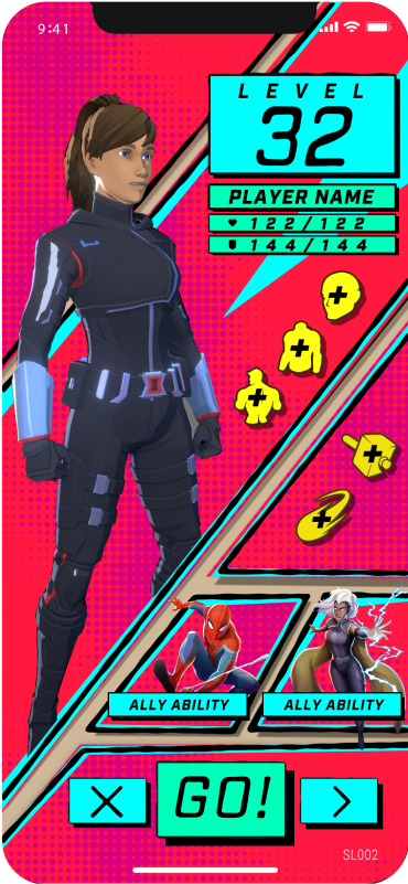
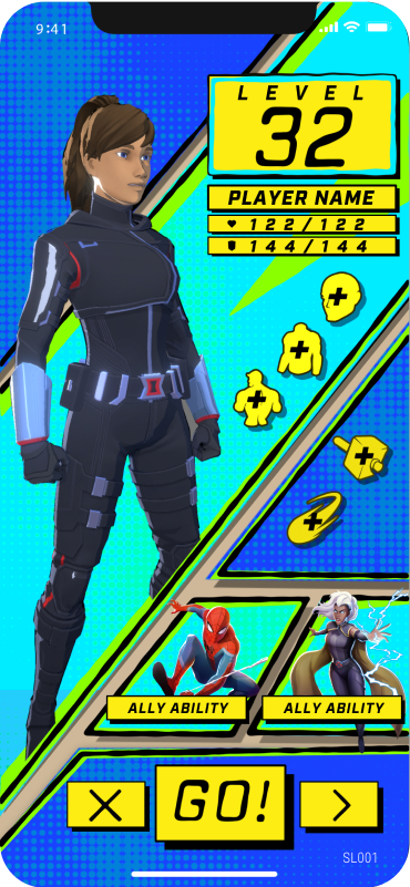
Each direction is applied to the same kind of player screen: a hero, a level, a Go button and the controls around them. What changes is the layout, the color, the type, how much of the interface shows at once and where the commands live. Four of the directions are shown here, and ten in detail below.
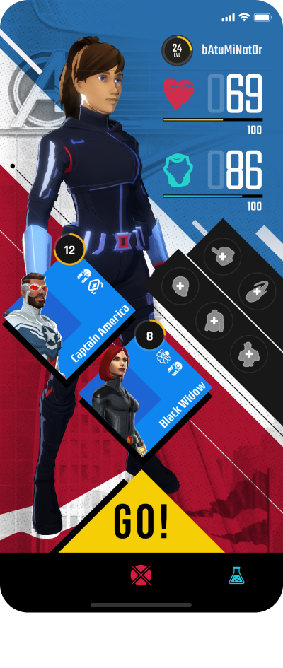
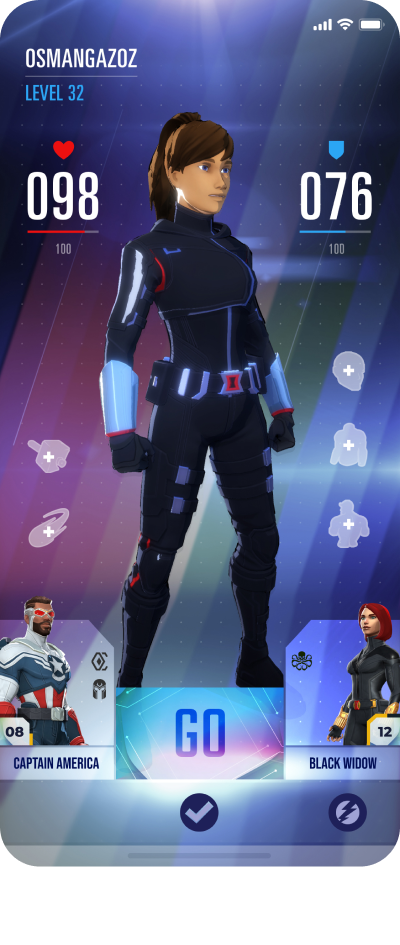
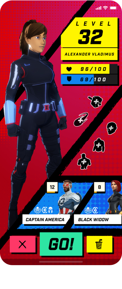
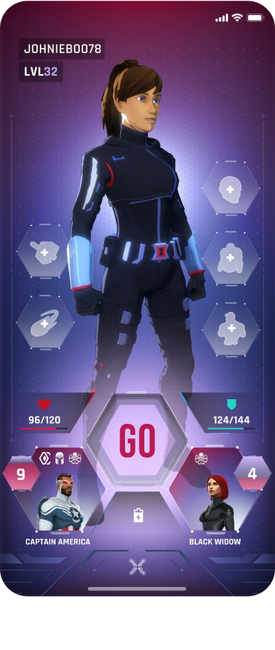
01Magazine
A black and white typographic background with serif fonts, so the interface reads like a magazine page.
02Graphics
Colorful backgrounds with graphic assets developed in sync with the character. Equipment sits behind a button to keep the screen simple.
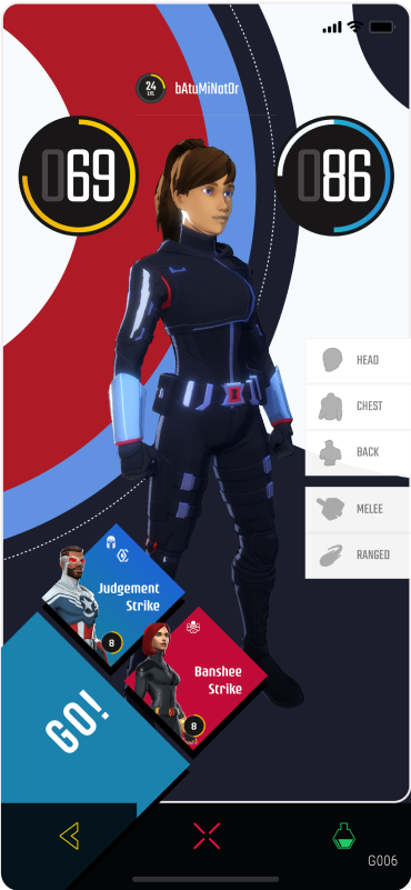
03Comic Book
Amorphous graphic shapes, script fonts, outlines and halftone patterns.
04Bound
Explores the 2D grid in depth. The essential commands are 3D buttons at the top, and the content sits in an infinite space behind them. A playful mix of 2D and 3D.
05Display
A clean layout with a bold color palette. Three colors, blue, yellow and orange, show the level of the player, and the scheme is fully customizable.
06Mixed Styles
Borrows from different design genres, including Bauhaus, retro arcade and geometric art.
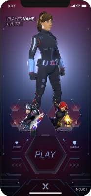
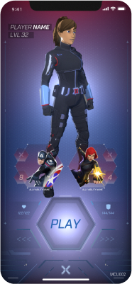
07MCU
Takes the look of a traditional MCU interface and pushes it further, using transparency and hexagons throughout.
08Art Deco
Frames designed with Art Deco in mind: a more elegant layout that keeps the style’s iconic shapes.
09Combat Load-Out
The closest to a traditional game inventory. Everything sits in a grid, with a place for everything and everything in its place.
10Stan Lee
Inspired by the comic books of old. Varying line weights, comic panels and halftones give it the feel of the Golden Age of Comics.
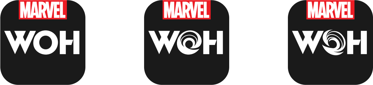
A W that teams up and an O that opens a portal.
Niantic also asked us for the game’s logo, app icon and brand identity.
You become your own Marvel super hero, in the real world.
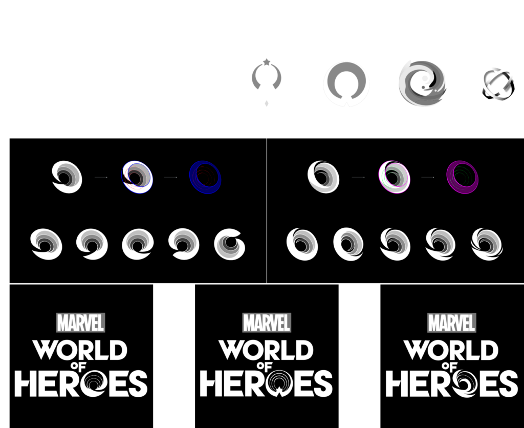
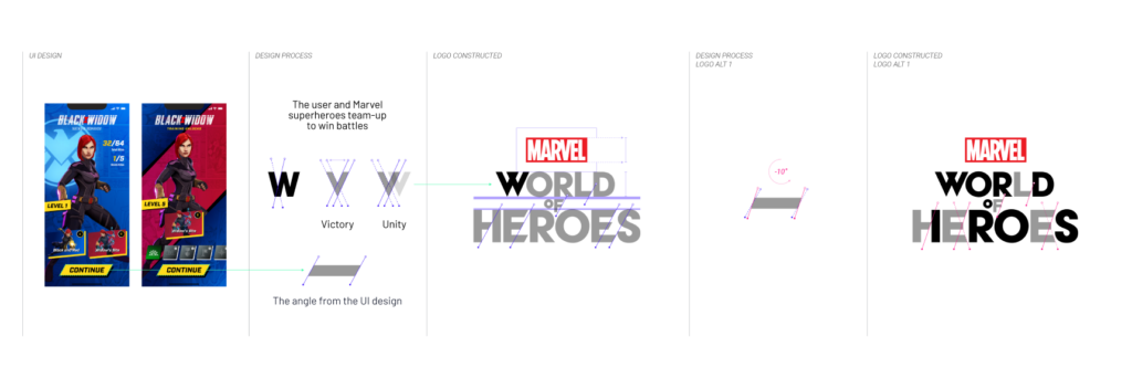
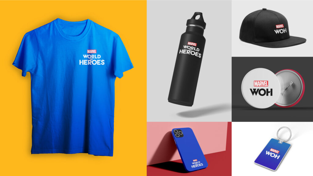
That was the brand vision. I led the team from research and a mood board to sketches, then through rounds of review with Niantic and Marvel to refine the marks. The W takes its angle from the game’s UI and reads as a player and Marvel heroes teaming up to win battles: victory and unity. The O is drawn as a portal.
I led the team through a wide range of color treatments for the logo, a nod to the game’s multiverse feature and to the Marvel Studios intro. Our R&D work informed many of the palettes and graphic elements.
Then the screens that carry the most information.
Two of the major screens we reworked were Mission and Campaign. Both are complex from a UX and UI point of view, and Niantic asked us to distill a large amount of information into a design that is attractive and easy to take in. We worked through five color directions, each with its own palette. In one of them, completed, active and locked missions each get a color of their own.
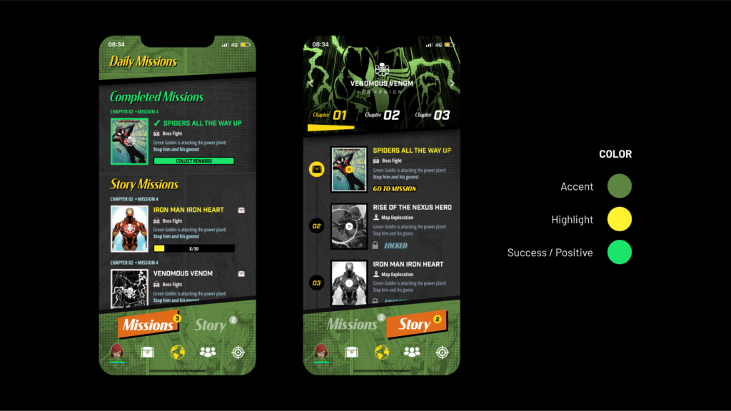
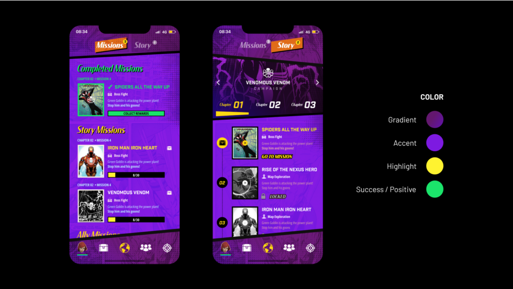
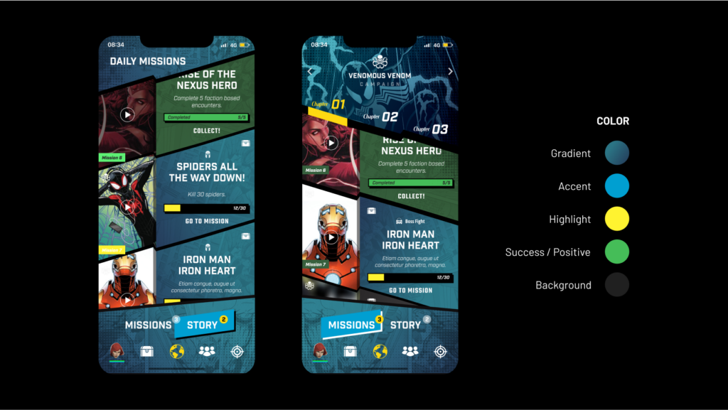
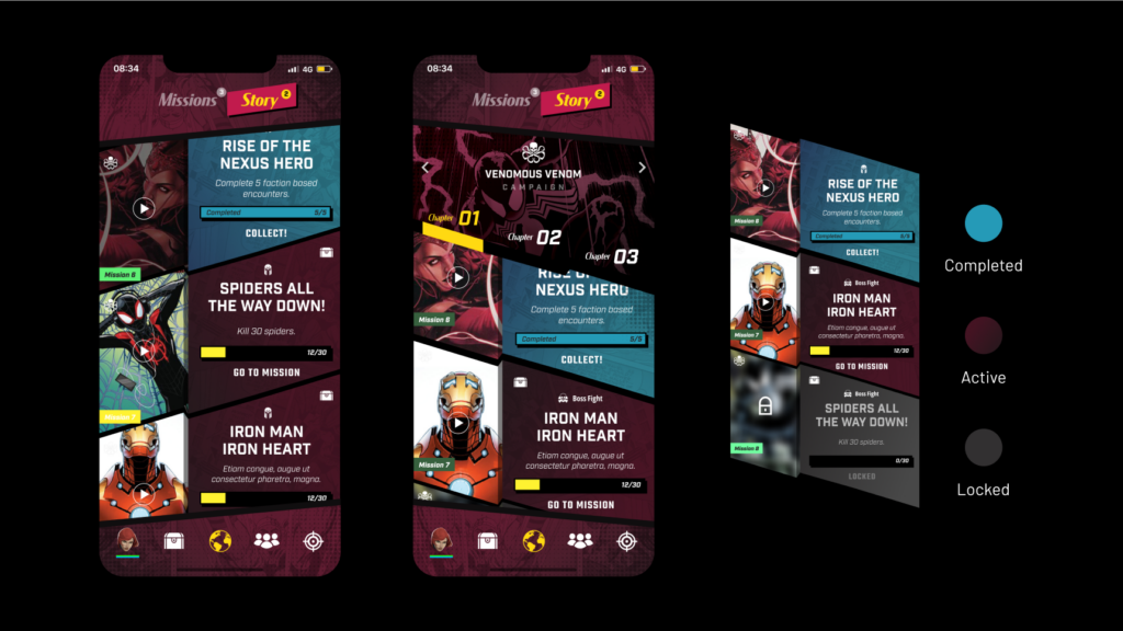
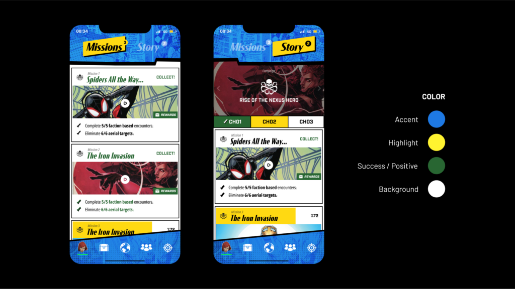
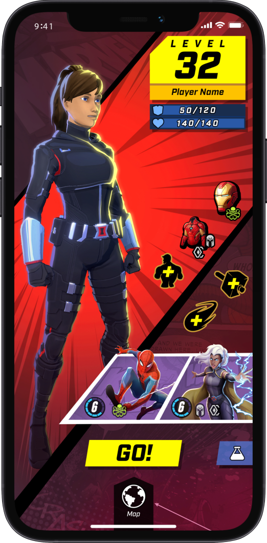
Five color directions for the Mission and Campaign screens, and a player screen in a phone frame.
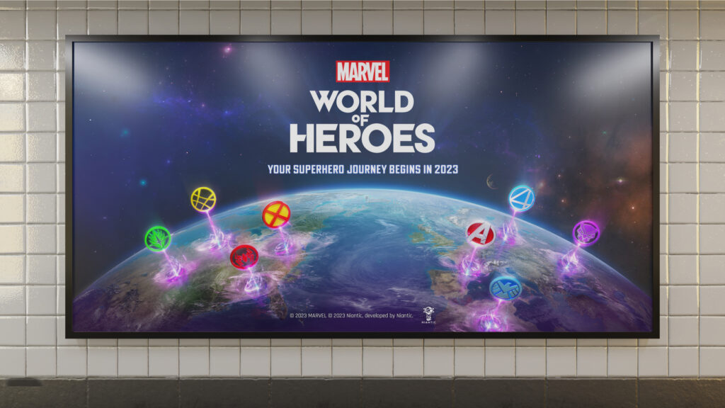
Client: Niantic, with Marvel. Dreamspace carried out the research and development, designed the logo, app icon and brand identity, and designed the game UI, including the Mission and Campaign screens. I led the work as Executive Creative Director and partner at Dreamspace. Images are from the project, and the billboard and merchandise images are mock-ups.
Marvel World of Heroes, Marvel, Disney and Niantic, along with their characters, names and logos, belong to their respective owners. The game was not released, and the screens shown are design work.
Sources: Marvel.com, D23 Expo 2022 announcement, Niantic, Marvel World of Heroes and Game Informer, June 29, 2023.
I lead design for complex products with many moving parts.
Creative direction, UX and UI for games, apps and platforms, from the first feature to the full interface, working alongside the people who build it.
Start a conversation